GRE Math Numeric Entry Question 309
Home > GRE Test > GRE Math Numeric Entry Questions
Next steps
- Use your browser's back button to return to your test results.
- Do more GRE Math Numeric Entry Questions.
Source: Other
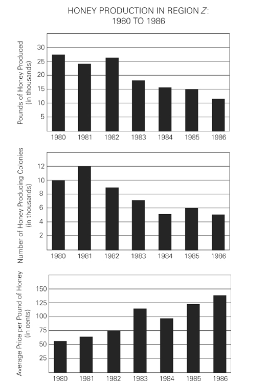
For what year depicted in the graphs was the percent decrease from the previous year of the number of honey producing colonies most similar to the average percent increase of the average price of a pound of honey for the six-year period?_____